AL GAR UX DESIGN
PROJECT BACKGROUND
PROBLEM
The target users of the Roast 'n Toast app are busy, health-conscious individuals who find it difficult to maintain a healthy lifestyle or special dietary needs on a tight schedule.
GOAL
Design an app for Roast ‘n Toast that simplifies the coffee ordering process for all users by allowing them to schedule pickup orders ahead of time and offering streamlined menu categories including those with special dietary needs.
ABOUT DESIGNER
My name is Al G. My role in this project as a UX designer was to take ownership of the app’s design.
PROJECT DURATION
APRIL 2021 - JUNE 2021
INDUSTRY
Food & Beverage
MY RESPONSIBILITIES
Conducting interviews, paper and digital wireframing, low and high-fidelity prototyping, conducting usability studies, accounting for accessibility, and iterating on designs.

Have your coffee
how you want it,
when you want it.
Roast ‘n Toast is a chain of local neighborhood cafés found throughout north New Jersey. Roast ‘n Toast offers a wide selection of premium coffees, baked goods, and healthy quick bites. Roast ‘n Toast primarily caters to customers who value convenience without compromising on healthy food options or quality.


USER PERSONAS
Two user personas were developed based on the information collected from the user interviews.


PROBLEM STATEMENT & HYPOTHESIS
Problem statements were created for our primary user personas and were used to develop hypotheses for the potential user experience.
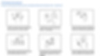
IDEATION EXERCISE: CRAZY 8s


COMPETITIVE AUDIT
The goal of this competitive audit was to compare some key features between a small selection of mobile apps or websites from competing cafés and café-like establishments. The key features selected for comparison are mobile app visual layout and navigation, menu selection, special dietary options, sustainability, checkout process, and accessibility features.
Full Competitive Audit Report can be viewed here.
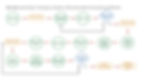
USER FLOW
STORYBOARDS
CLOSE-UP

BIG PICTURE
WIREFRAMES
PAPER WIREFRAMES
Several iterations of each screen of the app were drafted on paper ensuring that the elements that made it to digital wireframes would adequately address user pain points. For the check out screen, I prioritized a streamlined ordering process to help users save time and simplify the user journey.


*Stars indicate the elements of each sketch that would be used in the initial digital wireframes.
Green box indicates the refined versions of the wireframes.
USER RESEARCH
I conducted user interviews, created empathy maps, and affinity maps to better understand the users I’m designing for and meet their needs. A primary user group identified through research was busy, health-conscious adults who value convenience but don’t want to compromise on their healthy eating habits or quality.
This user group confirmed initial assumptions about Roast ‘n Toast customers, but research also revealed that apart from time constraints, customers also faced challenges when ordering, availability of healthy food options, and even customizability of their orders.
USER PAIN POINTS
TIME
SCHEDULING
QUALITY
Busy individuals have difficulty completing coffee orders on a tight schedule.
Food ordering platforms often don’t offer an option to schedule orders ahead of time.
Quality often diminishes when convenience is prioritized.
1
2
3
EFFICIENCY
CUSTOMIZATION
CONVENIENCE
Users want to order from a café menu quickly and effortlessly.
Users want ability to pick date and time to pick up orders.
Users want ability to repeat previous orders.
1
2
3
USABILITY STUDY: FINDINGS
AFFINITY DIAGRAM

PATTERNS AND THEMES
-
It was observed that 4 out of 5 participants most users prefer to order the same items after every visit. This means that most users prefer to order the same items after every visit.
-
It was observed that 4 out of 5 participants had trouble changing the location early in the process. This means that for most users, it’s very important to have the ability to change location before ordering.
-
It was observed that 4 out of 5 participants had trouble finding certain specialty items on the menu. This means that some users had difficulty navigating the menu.
-
It was observed that 3 out of 5 participants had trouble selecting a certain date for their order. This means that many users would prefer to pick a date along with a time for pickup.
-
It was observed that 3 out of 5 participants skipped the signup process. This means that some users prefer to not set up an account.
INSIGHT IDENTIFICATION
-
Based on the theme that: most users prefer to order the same items after every visit, an insight is: that the app should give them an option to repeat previous orders and change the quantities of the items they want to order.
-
Based on the theme that: for most users, it’s very important to have the ability to change location before ordering, an insight is: users should be allowed to change the location of the café earlier in the ordering process not just during checkout.
-
Based on the theme that: some users had difficulty navigating the menu, an insight is: that visual cues can be improved and menu items should be clearly marked and categorized to simplify the ordering process.
-
Based on the theme that: many users would prefer to pick a date and along with a time for pickup, an insight is: that a calendar should be provided along with a clock to give users more flexibility scheduling a pickup.
-
Based on the theme that: some users prefer to not set up an account, an insight is: that users should not be prompted to sign in to the app before ordering and should be able to place an order as a guest.
USABILITY STUDY
Two rounds of usability studies were conducted. The findings from the initial usability study were utilized to guide the designs from wireframes to mockups. Findings from the second usability study were utilized to refine the designs from the mockups and finalize these on the high-fidelity prototype.
Usability Research Plan

FIRST USABILITY STUDY: LOW-FIDELITY PROTOTYPES
Initial designs only allowed scheduling time-based orders, but after the initial usability study, I implemented additional functionality to the select time for pickup option. Instead of offering only a time option, I added a spinner so that users can select a date and time to schedule their orders.
View the Low-Fidelity Prototype here.
Before Usability Study

After Usability Study

SECOND USABILITY STUDY: HIGH-FIDELITY PROTOTYPES
The second usability study exposed some frustrations with the checkout process. To streamline this process, I removed the “Cart”, “Order summary”, and “Checkout” screens and replaced them with a single overlay. The entire checkout process takes place in this overlay, keeping the user from navigating through multiple screens. The “Schedule Order for Pickup” option is also included in this overlay.
View the High-Fidelity Prototype here.
After Second Usability Study

Before Second Usability Study

ACCESSIBILITY CONSIDERATIONS

TYPOGRAPHY
Typefaces are utilized with legibility, readability, and accessibility in mind.

ICONOGRAPHY
Icons are used to facilitate navigation between app screens and feature extended touch target areas.

COLOR
A color palette that offers better contrast between text, icons, and other app elements is implemented throughout the interface.
HIGH-FIDELITY PROTOTYPE
The final high-fidelity prototype presented a more streamlined checkout process. And it fulfilled user needs for order type and scheduling options.

DESIGN SYSTEM

FINAL UI DESIGN

TAKEAWAYS
IMPACT
The app makes users feel like Roast ‘n Toast is actively working to fulfill all their needs.
One quote from peer feedback:
“This app is designed in a manner that ticks all the right boxes. It is something I would consider using if it were used by a big name brand.”
WHAT I LEARNED
Designing the Roast ‘n Toast app taught me that designing forms only a small part of the entire design process and is entirely dependent on insights derived from user research. User research taught me how to become more attuned to the needs of the users and is key in making informed design decisions.
thank you!

USER JOURNEY MAP
Mapping a user journey for Leah, one of our user personas, revealed how much more convenient it would be for users to have access to a dedicated Roast ‘n Toast app.


DIGITAL WIREFRAMES
During the initial design phase, I ensured that the screen design iterations were based on feedback and findings from the user research.
Clearly marked categories and better organization were key user needs that had to be addressed throughout the design process.